December 10, 2020
By Rafal Raciborski, Senior Statistical Developer
Mather Economics is an economics consultancy based in Atlanta, GA; serving more than 200 companies around the globe in a variety of industries including Healthcare. Our expertise in analytical and econometric services provided the unique opportunity to assist in this project. Mather Economics was approached by a healthcare organization to implement celeration charts using Stata as a better way to plot trajectories of Coronavirus cases during the pandemic.
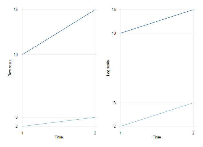
A very good option to provide a visual comparison of growth rates over time is using a logarithmic scale. Using this method, a change from 2 to 3 and a change from 10 to 15 result in the same slope because 2 and 10 increased by the same percentage.
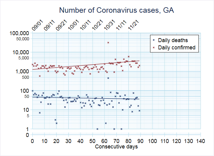
The standard celeration chart is a stronger method to plot growth rates on a log scale. The standard part imposes a pre-defined grid so it is easy to compare notes with colleagues. The chart has been used for decades in education and behavioral sciences to track acceleration and deceleration in human performance. And in 2020, the chart is now being used for plotting trajectories of Coronavirus cases.
The resulting Stata command offers a flexible and intuitive syntax to control the look of each series as well as the overall graph. With just a few lines of code we can create a beautiful celeration chart like the one below.
In the future, our client organization is planning to use celeration charts for tracking suicide rates in rural areas and other resource-poor communities as well as for tracking performance on HEDIS measures in provider dashboards.
Mather Economics also provides custom data management and reporting tools, code review and optimization, and Stata training tailored to your business’s unique needs. Contact us to discuss how our expert team can help.